Redesigning flagship Mobile App feature
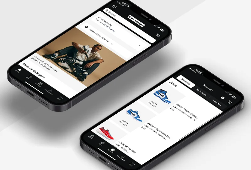
Leading the design team to reimagine the Launch Online Reservation experience,
and making getting products faster and easier.
and making getting products faster and easier.
Context
"Launch" was Foot Locker's flagship product
Food Locker's brand identity was tied to its Launch app feature which sells retro, hard to get shoe releases.
This was huge part of its connection to a customers. And to sneakerhead culture, at large.
This was huge part of its connection to a customers. And to sneakerhead culture, at large.
Problem
Getting retro releases through Launch was a painful experience
For customers
- Releases were first-come-first serve online
- Bot users would get all the inventory
- Customers were forced to stand in long lines at stores to pick up their won items
For business
- IT support was overtasked at release times
- Store personnel were overwhelmed
- Reputation was low against competitors
How might we
...make getting retro shoes easier, more fair, and bolster the company's reputation in the sneakerhead community?
Solution
An raffle entry experience, plus ship to home
Instead of forcing first-come-first-serve only, allow all customers to fairly sign up for a chance to win.
More convenient
UX research showed customers preferred online shipping over picking up in store
More fair, more good will
Prevents bots so core customers can purchase without competing against resellers
More competitive
Online reservations, known for premium brands, elevate Foot Locker's brand reputation
SO, WHAT ARE SOME CORE PRODUCT REQUIREMENTS?
Allow pre-orders
Shift the experience to a purchase-before-release flow
New “Ship To Me”
Customers don't have to go to store to pick up their won item
Multiple fulfillment
Let customers opt in to try and win for both Ship To Me and In-Store
Communicate rules
UX copy accounts for all conditions and financial details
Exploration A
Numbered steps
What if the raffle itself was like a checkout experience?
After all, customers are "purchasing" in a way (just, before the item releases).
While this seemed like a right move, it ended up making the process too long. I got feedback from user testing that showed this needed to move faster.
After all, customers are "purchasing" in a way (just, before the item releases).
While this seemed like a right move, it ended up making the process too long. I got feedback from user testing that showed this needed to move faster.
Exploration B
Bottom sheet
How about a bottom sheet that slid up across the experience?
The idea was speed. By not taking the user "away" from the product page, they can feel a sense of quickness.
The problem with this was there was too much happening in a bottom sheet. I had this reviewed at the team's design critique and we all felt the experience needed room to breathe.
The idea was speed. By not taking the user "away" from the product page, they can feel a sense of quickness.
The problem with this was there was too much happening in a bottom sheet. I had this reviewed at the team's design critique and we all felt the experience needed room to breathe.
Exploration C
Open form
✅ Chosen solution
A one-page form with the bare essentials of the product was put together.
The user just needs to (1) select their size and (2) how they want to get their item if they win it.
This ranked the best in user testing and was the most scalable design. We have a winner.
The user just needs to (1) select their size and (2) how they want to get their item if they win it.
This ranked the best in user testing and was the most scalable design. We have a winner.
CHALLENGES
Some things that came up, and how I resolved them
Challenge #1
Credit card issue leading to copymaxxing
Pre-purchasing via a raffle meant pre-authorizing users' credit cards. Legal and Finance wanted lots of copy and disclaimers displayed throughout the experience.
The risk? A bogged down experience with too much friction.
The risk? A bogged down experience with too much friction.
Solution
- My designers explored multiple ways to inform users
- As lead, I partnered with Legal and Finance on the most concise copy
- I also worked with Engineering on the clearest visual display through a native app experience
Challenge #2
Inefficient overly frequent copy reviews
This product was owned by Marketing budget. So, design reviews included the CMO.
UX passed quickly, but copy was held for multiple reviews, pausing UX deliverables and cutting into final UI delivery timeline.
UX passed quickly, but copy was held for multiple reviews, pausing UX deliverables and cutting into final UI delivery timeline.
Solutions
- New workflow. I brought copywriters from Microsoft Word into Figma to increase collaboration and speed
- A visual indicator. I introduced an orange font for copy review so wireframes had FPO copy clearly listed for leadership to focus on
- Adjusted delivery. I adjusted our copy approval cadence frequency to mitigate Marketing's concerns before each review
These steps solved the bottleneck for Copy and got this high-impact and high-visibility feature delivered on time.
BONUS: FUN TIDBIT I LEARNED
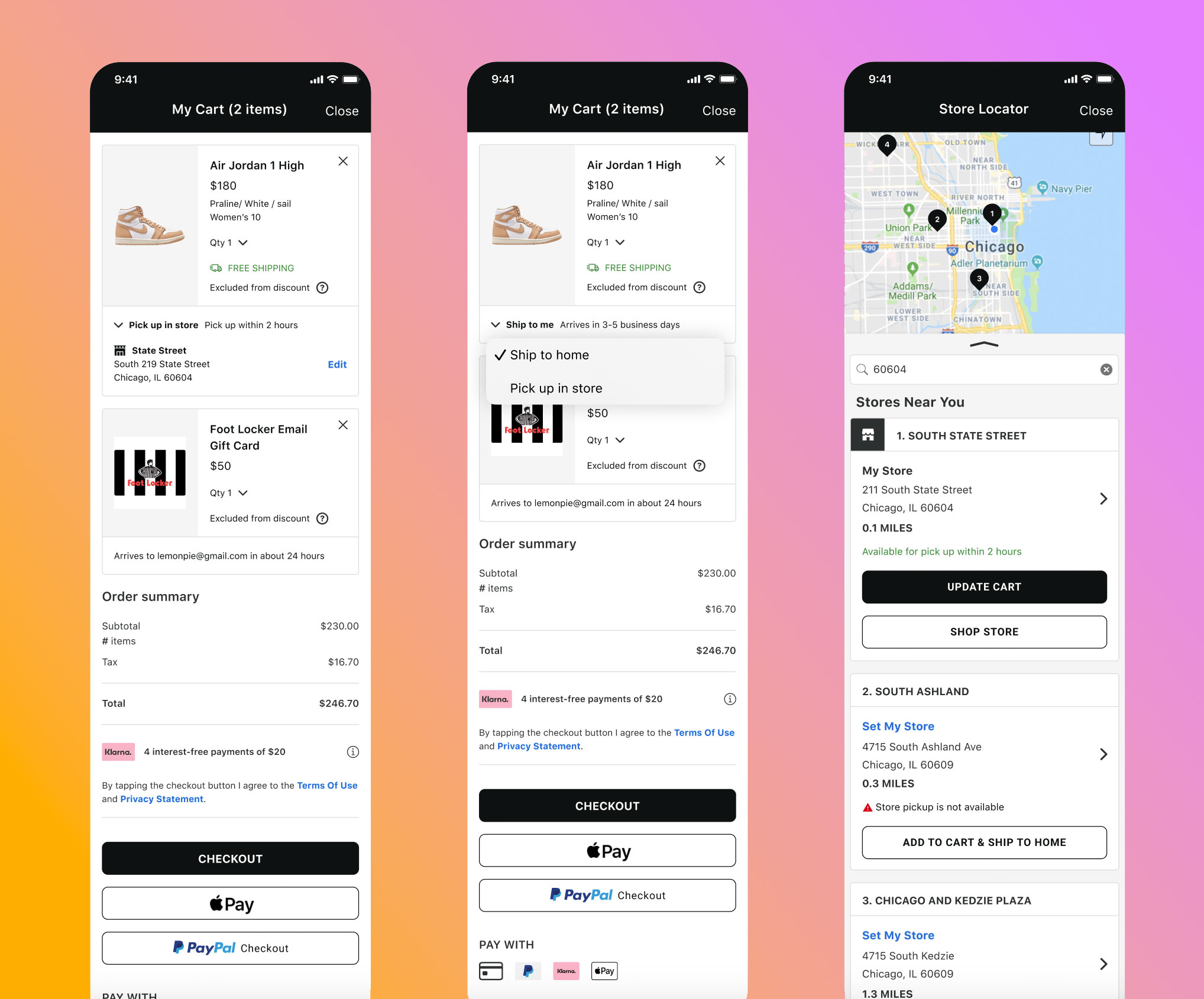
Native maps differ between iOS and Android
Here's a fun thing I learned on this feature from engineering. Turns out maps with lists must display a certain way for each OS.
- iOS - a list can display below
- Android - tiles must overlay on the map
Takeaway: Design the UX to account for both mobile operating systems, and if need be, let UI "design" the UX and approve it
Impact
The Launch Online Reservation was a success both in design and sales performance. Here's some of the impact it had for business.
18.7%
YOY sales increase, meeting the direct sales goal set for the new experience.
37.7 → 80.2
CSAT score improvement from May to December of the fiscal year.
↑ Reputation
Praise and recognition from the sneakerhead community on YouTube, Reddit, and X.
REFLECTIONS
“I wish we had more time to create a more omni-experience.”
One of the thoughts I had was on if this experience could have been a fuller, more end-to-end retail experience that was truly omnichannel.
Since the scope of the feature was for the Mobile App only, there was no consideration for a way to make this connect to the in-store buying experience.
Given the opportunity, I would have the business expand to a phase 2 of this feature to bring that all together.
Since the scope of the feature was for the Mobile App only, there was no consideration for a way to make this connect to the in-store buying experience.
Given the opportunity, I would have the business expand to a phase 2 of this feature to bring that all together.
SHOUTOUTS
Thanks to my Design Team and partners in Product and Engineering that helped make this happen.
Katie Foley
UX Designer
Jon Flood
Sr. UI Designer
James Vanaria
Director of Engineering
Maggie Chandy
Product Manager
Boris Hartl
UX Writer
Annie Chiang
UX Director
✕
✓
{{ copyCountdownLabel }}
Close
🔒
Let's meet to view this case study
Copy my email and get in touch to walk through this one
saqibshafi@gmail.com
{{ copyMainLabel }}